Enterprise Design System - ARGO X
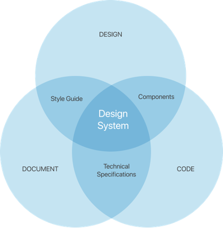
The ARGO X design system sets standards, unifies design patterns, and is a source of best practices for development, product, and design teams to help understand and develop our products going forward.
ARGO Data
Role • Lead UX Designer
Tools • Figma, Storybook JS, ZeroHeight
Timeline • 2022–2024
Why create a design system?
There are three key reasons:
Cohesiveness between development, design, and product teams.
To organize and document guides, designs, code, and usage for components across all teams.
An easy way to visualize our design library and functional components. It also makes it easy to reuse code directly into developers’ frameworks.
Main Challenges
Multiple products within banking and healthcare industries with lack of design consistency.
Various tech stacks and frameworks being used, a mix of older and newer ones.
Lack of Storybook component library for development.
Affected Products
Financial Services
Banker dashboard
Teller application
Digital banking platform
Healthcare
Behavioral Health CareChain
Enterprise
Internal Audience
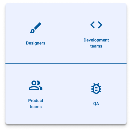
The design system is socialized to the entire company. Every department has access to the design system but the main audience consists of designers, development teams, product teams, and QA teams.
Component Library
A component library is a collection of reusable code elements, known as components, that are designed to be used in various products across ARGO. These components encapsulate specific functionality or user interface elements and can be easily integrated into different projects, providing consistency and efficiency in development.
A component library acts as a repository of reusable software components that streamline the development process, enhance consistency, and improve user experience by promoting best practices and design standards using a combination of HTML, CSS, and JavaScript.
Storybook JS
At ARGO we leverage a Javascript library called Storybook to help Develop our UI components independently in isolation without the business logic to showcase it interactivly.
Set the Foundation
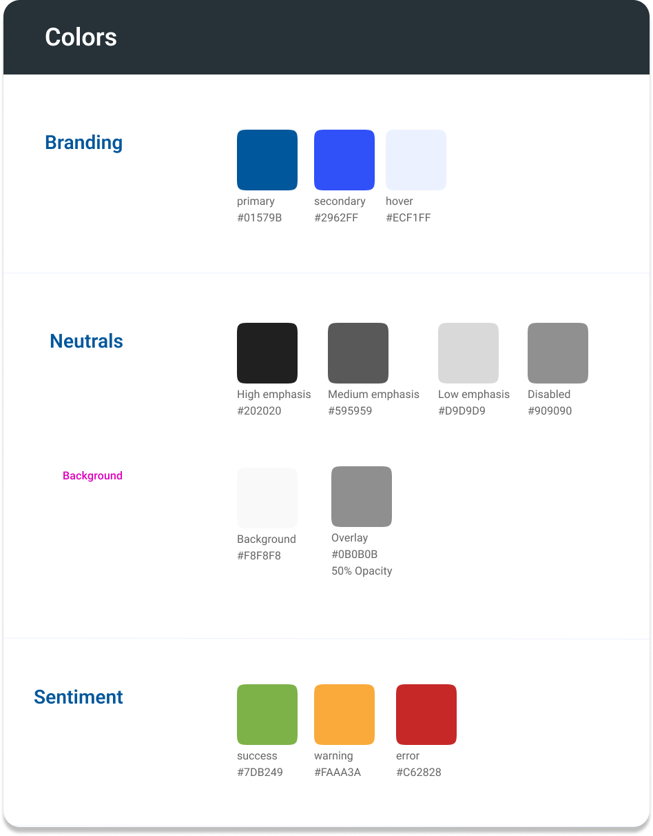
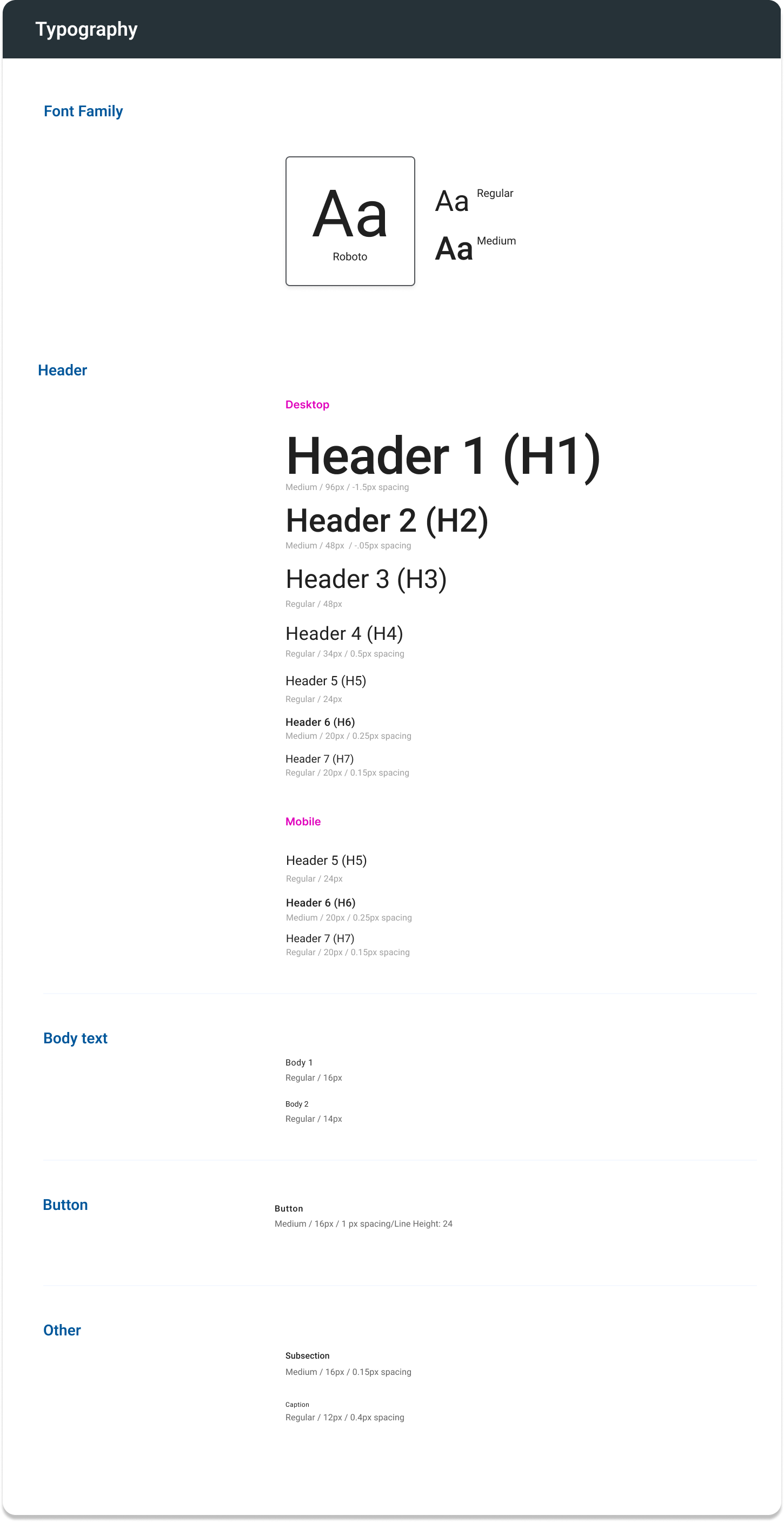
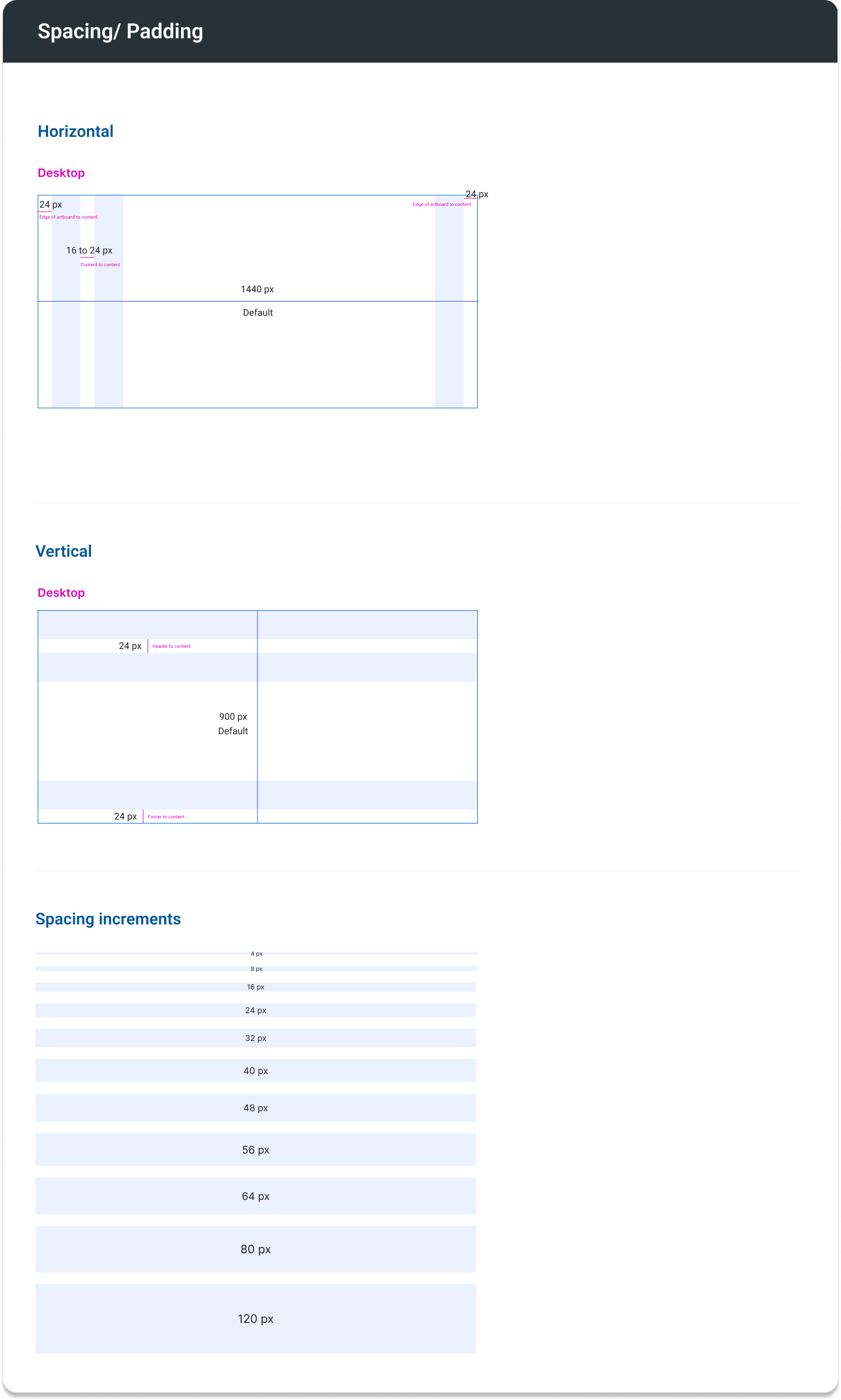
Establishing the foundation is the first step in building any structure. Core elements such as colors, typography, layout, icons, and elevation were standardized first. Given that all of our products are different, deciding on a similar, yet new direction was our decision as a team.
Input Components
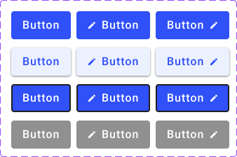
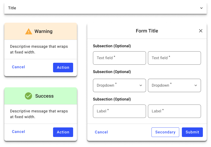
Input controls are interactive elements of the Interfaces. It allows users to enter the information into the system’s interface.
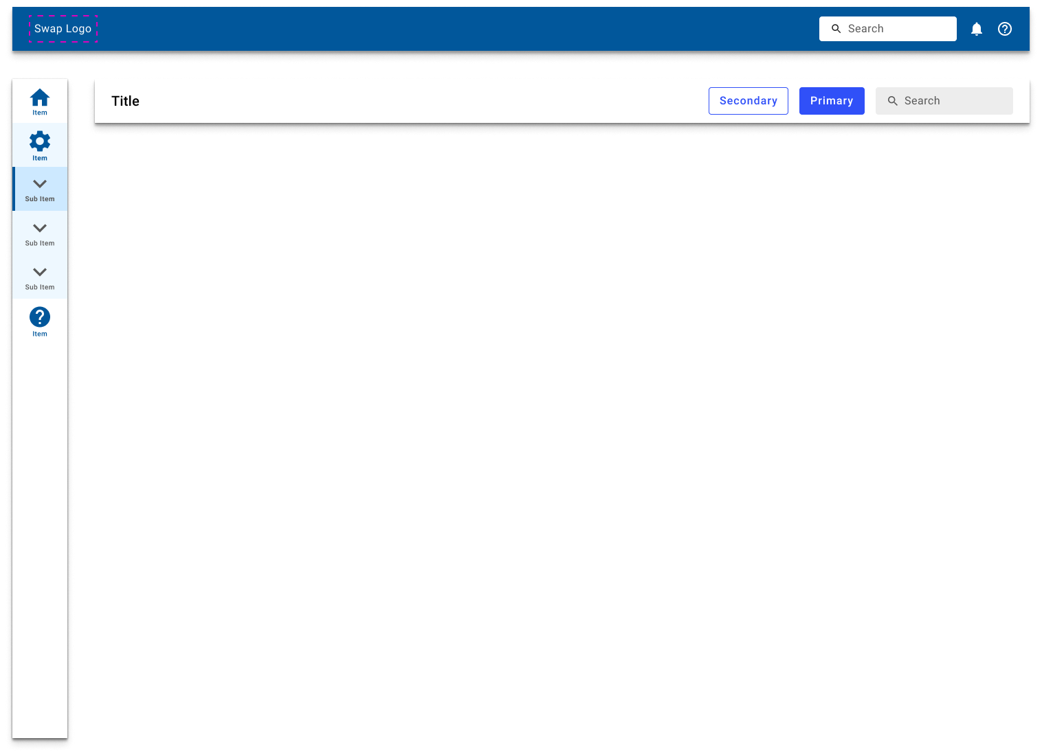
Navigation Components
Navigation is defined as the set of actions guiding the users navigate/move around the app so that they are able to complete their tasks easily.
Surface Components
Surface Components refer to a type of component that provides a container for other UI elements.
Guides
ARGO X is also place where standards and guidelines outside of design live. Here are some examples of downloadable guides we have accessible internally that were created by various sources:
Accessibility guidelines
KPI planning guide
Online help systems guide
Color guide
Data Visualization
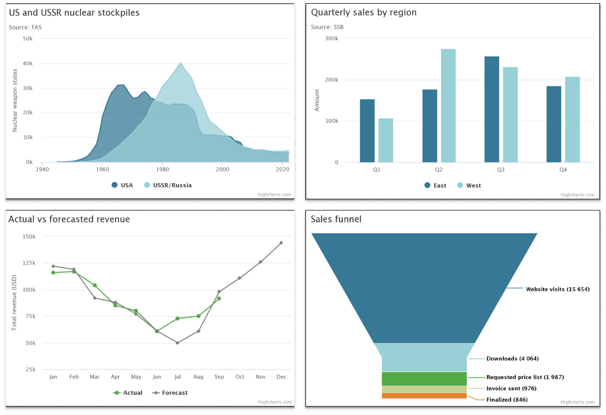
With ARGO’s increased focus on improving KPI reporting and developing direct-to-consumer applications focused on analytics, it is very important to understand data and how to visualize it.
Data visualization is the graphical representation of data and information, using charts, graphs, diagrams, maps, and other visual elements to communicate complex data sets in a clear, concise, and intuitive way. The goal of data visualization is to transform raw data into a visual form that can be easily understood, analyzed, and communicated to others.
Putting it all together
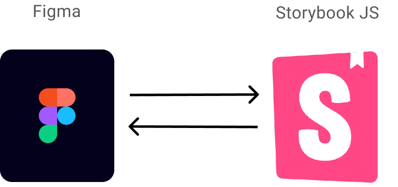
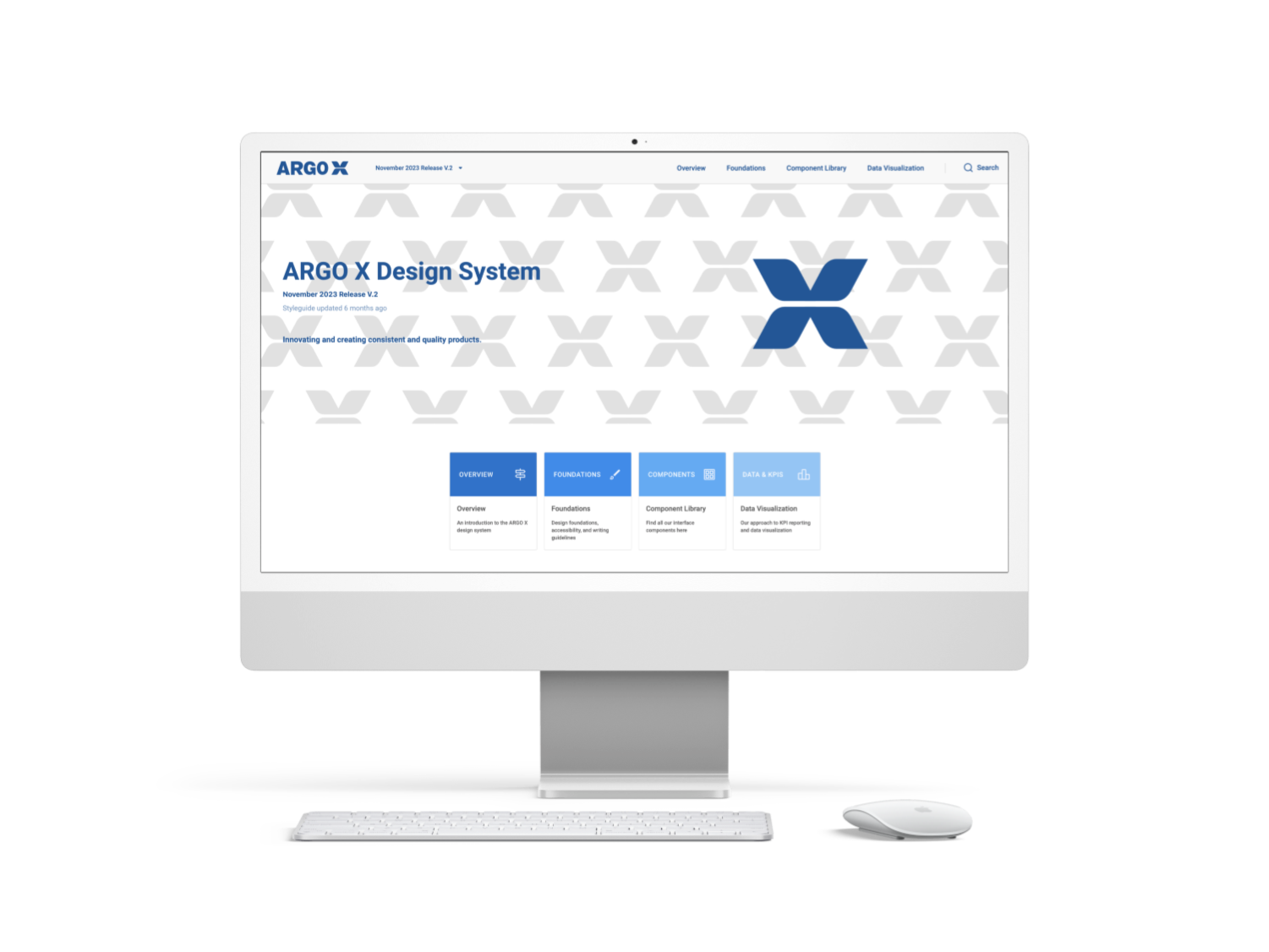
ARGO X was published using a third party tool called ZeroHeight which is essentially a website builder that integrates with both Figma and Storybook.

